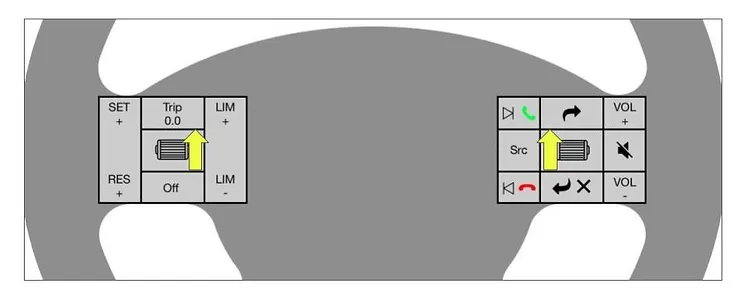
How do we aim to make them more subtle, and less overwhelming? (And please, more fun??)
I have had the chance to think about car dashboards (the cluster specifically) for some time. The more I think, the more atrocious they seem. It prompts me to as 2 questions:
Does a car's dashboard reflect the experience the customer would want?
How can it become less overwhelming, and more like an extension of your brain?
I think the answer lies in upgrading the technology, but before we reach there, we will have an interface and need to design it better.
I could not help but start sketching some quick and dirty ideas (Industrial designer problems). And then I followed it with some designing. This is me thinking out loud.

1. The car greets you (it knows you by connecting to your Bluetooth when you enter) You get a warm greeting with a quote to start your drive off.

2. Scroll to start your journey

3. The landing page minus all the big notifications and other such widgets.
Having different saturations for different times of the day


4. The reason why you sit in a car is to go reach a destination. So having 2-3 destinations custom saved can help you start the navigation with minimum number of clicks.
This can be useful for office, home, gas station, etc. You can customize this menu.

5. The right side of the screen will be used for other apps like music, voice-over calendar, calls, etc.


This is as far as I could get. It is a WIP, but I find this process of coming up with a solution so fulfilling. I want the car to be sexy from the outside, but far more comfortable inside. It should be fun driving. It should not distract you from what you set out to do.

Cheers!
-Aditi
Comentarios